Time series Analysis
This script explores some built-in methods for analyzing a time series. This script will only work on Matlab 2016a forward since the built in wavelet scripts have only been introduced recently.
Contents
Load sample data
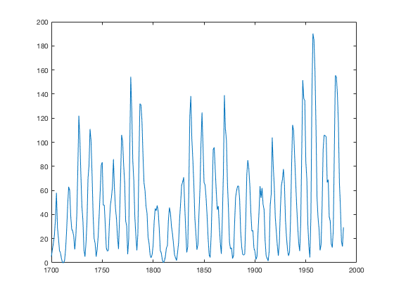
For this first example we use the built-in Matlab dataset of the number of sunspots yearly from 1700-1987.
load sunspot.dat
Examine the data
There appears to be some patterns in the time series however it is difficult to determine the exact values only by looking at this plot.
plot(sunspot(:,1),sunspot(:,2))
Periodogram
The periodogram is the spectral power of the signal in frequency (period) space. This type of plot allows us to easily pick out the dominant frequencies (periods) from a given signal. The function "periodogram" returns the power spectral density and the frequencies.
[psd,f] = periodogram(sunspot(:,2),[],[],1);
period = 1./f;
plot(period,log10(psd))
xlabel('Years')
ylabel('Logarithm of PSD')
axis([1 50 0 5])
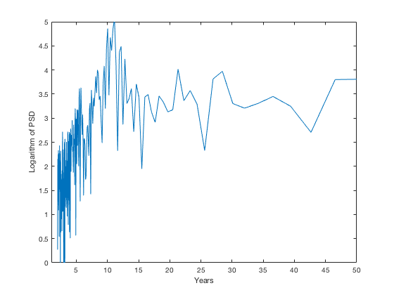
We can now clearly see that there is a spike in the spectra at an ~11 year period. We can see smaller peaks at ~6 years, ~21 years and ~28 years. The dominant period lines up exactly with the well-known sunspot cycle.
clear
Time-varying periodicity
In many cases a given time series will contain a relevant frequency however it will only be dominant for a given time. Since when using the Fourier transform no temporal information is retained, a periodogram will not necessarily be able to indicate this to you. One solution to this is to use wavelets. Matlab has built-in wavelet functions which are easy to use, however, for more information about wavelet a good resource is: http://paos.colorado.edu/research/wavelets/.
Load the data
For this example we will be using a sample of Sea Surface Temperature (SST) data from: http://paos.colorado.edu/research/wavelets/software.html.
load sst_nino3.dat
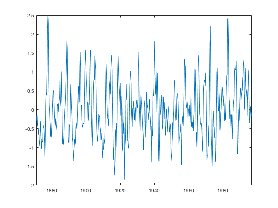
The data is the sea surface temperature anomaly relative to the yearly mean, computed every four months since 1871.
In order to properly use many of the built-in functions we need to have the time as a datetime object. For this we use the years function to accurately represent a quarter of a year and the datetime function to create the start date.
dt = 0.25*years(1);
time = [0:length(sst_nino3)-1]*dt+datetime(1871,1,1);
Examine the data
Looking at the raw data it is very difficult to accurately pick out any patterns or structures in the data.
plot(time,sst_nino3)
Continuous Wavelet Transform
To use the Continuous Wavelet Transform (CWT) you use the "cwt" function. If you provide it no output it will plot the wavelet spectrum by default. You can also have it return the wavelet transform wt, an array of the periods period, and the cone of influence, coi, by using the notation [wt,period,coi] = cwt(timeseries,delta t).
cwt(sst_nino3,dt);
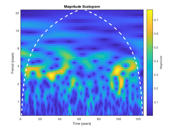
You can see that there are peaks in power at ~ 3 year periods, however it is intermittent. These correspond to El Nino years which appear to occur roughly every 3 years though at many times they are not dominant. We can also see the white dotted cone which is what's called the cone-of-influence which indicates regions beyond which edge effects impact the accuracy of the wavelet analysis (don't focus on anything outside the cone).